 |
Horst Fasel was trained as a graphic designer. Whether on a sheet of paper, a cardboard, a canvas... he knows exactly where to place two simple dots, a line, a colored patch... to achieve the perfect balance.
On whatever surface, he can play indefinitely with the shapes to make a multitude of possibilities pop up. In the same way as music is contained in a small number of notes, the harmony may spring from just a few traces on a given material. Fasel is a painter, wholly a painter. That is, his means of expression, his specific language is that of lines, surfaces and colors. It comes as no surprise that a dancer or a musician has been trained and training at length, expressing themselves with the technique they have been able to develop and deepen; on the other hand, the person viewing a painting will want, prior to feeling an emotion, to have the work be explained by means of words. Horst Fasel is the very kind of painter that requires from the one contemplating his work not to think, but first watch. |
|
 |
 |
|
Accepting the challenge will let the viewer get into a work that is often a game, a stimulation of intelligence, an encounter with humour, imagination, unexpected findings, the diversion of beigns and things. A world in which discoveries have a disorienting and staggering effect.
These creations require from you, somehow, that you get back into the condition you were in as a child, when the objects were all objects of ingenuous exploration and astonishment. Their usefulness was unknown to you and each of them meant questioning, investigating, a ludic possibility.
The abstract shapes have their own life which, with their outlines, their deformations, their movements, the way they occupy the space, allow you to experience the same marveling surprise as visiting a submarine world inhabited by creatures different from those which are familiar to us on the earth.
The series of paintings, between 1968 and 1970, demonstrate the play between the shapes and the surface they occupy.
The painter often appropriates the paper rectangle by drawing inside a more irrgular, flexible and distorted frame to show that one settles down in another domain than that of the sheet of paper on which one writes in a quiet and regular manner. He gives life in this recreated field to a series of light, inventive pictures in which shapes are going to develop, like amoebae under the microscope, surprising and strange creatures. There are many different kinds of creations whose unexpected effects evoke the short piano pieces by Eric Satie. A wise game, a fascinating pursuit between the shapes and the locations they occupy in turn. They divide the surface into twos, into squares, and into diagonals. They join the different subdivisions of the paper, remaining abstract or unexpectedly taking on human or animal shapes. Like foetuses stretching or curling up in the mother's uterus, they lengthen, distort, shift into the corners and start growing and metamorphosing before our eyes.
|
|
|
|
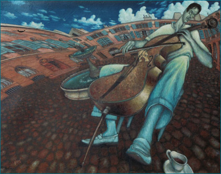 Jean-Louis Lumineau avec son violoncelle Jean-Louis Lumineau avec son violoncelle
|
|
From 1968 to 1970, the space comes alive with light, floating, almost impalpable shapes. They are transparent, allusive, fluid, almost ethereal bodies. Their vertical position makes them look like creatures levitating in a translucent liquid. Very often, their outline is delineated by a single stroke. The colors too are faded. It is a world of strangely shaped, elegant and subtle jellyfish, in which things weigh nothing and everything is merely suggestion.
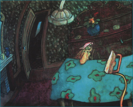
From 1971 to 1979, the works gain in consistancy; there are volumes, drop shadows. The surface of the canvas becomes a more material area. A place for life. The painter lays out perspectives, partitions and ceilings. He installs some furniture, some tables, some chairs... Silhouettes take shape, stretch, distort and are filled with strange viscera that suggest the the emergence of an organic life.
From 1980 to 1983, this trend to include the real is confirmed.
The space gets larger and larger, the objects, the characters are more and more concrete. One sees through a distorting lens, often tinted, a still-life, a character, whole scenery. The anamorphosis of a huge town square with drinkers seated under the trees, a performance hall, a living and picturesque crowd of individualized silhouettes.
|
|
Monochrome portraits evoke old photographs with faded colors. The artist has now resolutely gotten into the real. He shows us a convivial Midi area, a happy life, with portraits of acquaintances, friends and characters met every day in the street or on the terrace of a café.
These works that seem to be only monochrome, ultramarine, sepia, turquoise paintings... contain in fact a series of subtle ecru, bistre, pink variations as well as the whole range of beiges, greys and blues.
From 1984 to 1990, it is a period of quiet intimacy. There are still-lifes with wisely distorted objects and a layout out of the ordinary.
The cup of coffee, the glass and the bottle have permanently replaced abstract shapes. The matter has become thicker, fleshier.
Characters with unexpected silhouettes seem to have been contaminated by the shape of the objects next to them. Broadened faces, long, sinuous bodies topped by tiny heads, distortions due to exaggerated perspective. The representations are not created with a view to provide the true aspect but to let us see the transformations they have been subjected to while in the painter’s world. This period is that of the consummate colorist.
Fleshy colors of the woman with the tulips, a blue hair with both a fresh and burning touch. Green, brick pink and creamy-white still-lifes.
We have to let ourselves be surprised by the unexpected and the daring matches, like chords in music, by some wanted discords.
His portraits seem to be very different from each other at first sight. Some are monochrome, other have violently contrasted colors.
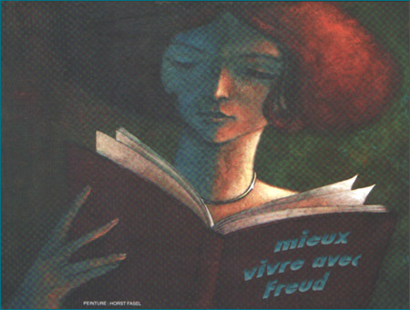
Each portrait has been treated in a different manner. One feels that he has, in front of his model, looked for the dominating color, the characteristics, and the style which would best bring out the model’s own individuality. A portrait is the intimate combination of the appearance and the inner aspect of the model posing and what the painter feels in front of his model. The point consists in summing up, in a single picture, the model’s personality. This is not achieved by showing an immediate and obvious aspect, an expression of the face or of the body, but by condensing everything the artist knows and guesses about the model. Indeed, these are usually portraits of friends he knows well and approaches with humour and affection. However, he keeps in mind the fact that this picture, although it represents an autonomous individuality, should find its own place within the whole work. For this purpose, he uses the color, the lines of style to express the model’s personality, his own, his artistic choices, and synthetize them in a painting.
|
|
|
For a period of time, Horst Fasel lived in Auribeau, a village located north of Cannes. His workshop window opened onto a landscape whose lines, vegetation colors, ground unevenness, rightness and harmony represented a place of perfection for both the eye and the spirit.
Horst Fasel undertook, day after day, to select a number of details among all these elements, particular places from which he always drew both original and inspired works. Some are abstract paintings, others show intertwined, wild grass, bundles of flowers and plants, homes, walls and superimposed fields. One always finds in these details the parts drawn from this landscape, the beauty and light of the whole scenery.
During this very period, the painter demonstrates, even more eloquently, his colorist’s skills.
The paste is thicker and the color harmonies are full of viguour and boldness. In particular the deep blues and greens in which judiciously positioned yellow, orange or red patches, increase the intensity. The paint becomes a painted object, yet without losing its properties as a raw material, as such directly from the tube. Fasel also knows how to harmonize, in a softer range of colors, pastel colors such as pink, pale yellow, all the shades of greys and browns that let us appreciate the degree of virtuosity in both the major and minor tonalities.
|
|
The entire work demonstrates the joy of inventing, using the resources of his art. He naturally confines himself to the possibilities provided by his art. Throughout his career, he has taken into account all the attempts made by contemporary painters.
He has understood the research of his fellow people, trying out in turn the different techniques achieved. But he followed his own path, and his creations gained both in consistency and weight. With purely ludic and graphic attempts as a starting point, he will get more and more into the real and eventually take hold of it. |
 |
| top |
|
|


